The forms of contrast I used:
1st design: With the dragon I wanted to create a contrast with all the colors I used from my culture project board. The orange + pink especially stand out with contrasting with the greens + blues.
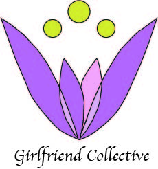
2nd design: The contrast I used was the purple pinkish tones with the bright yellow to bring some pop into the logo design
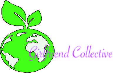
3rd design: For this third design I wanted to tie into the green movement girlfriend collective is about. So, I decided to trace a earth with a plant growing out of it to symbolize the sustainability girlfriend collective stands by. The contrast I used for this one was the bright purple pink lettering to show the customer what they should be looking at.
