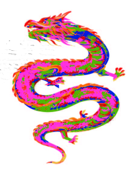
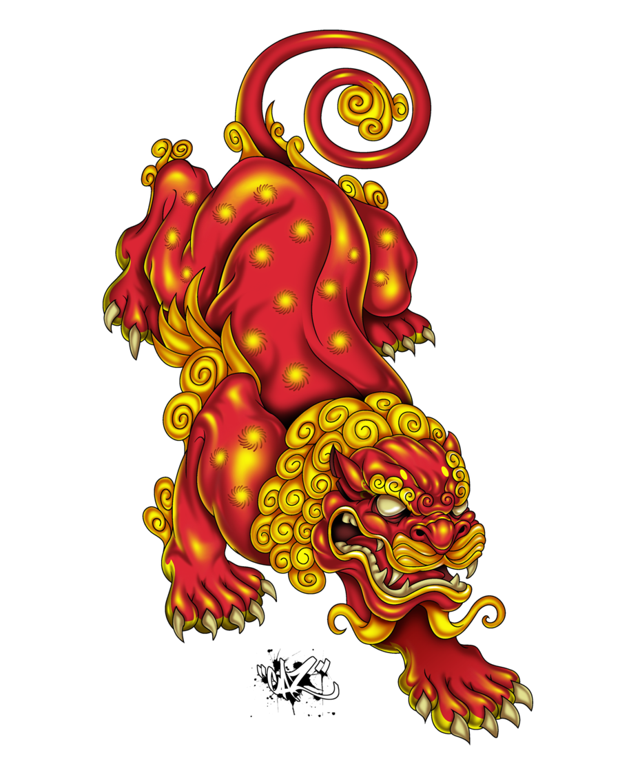
1st design: With the dragon I wanted to create a contrast with all the colors I used from my culture project board. The orange + pink especially stand out with contrasting with the greens + blues.
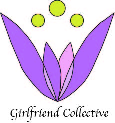
2nd design: The contrast I used was the purple pinkish tones with the bright yellow to bring some pop into the logo design
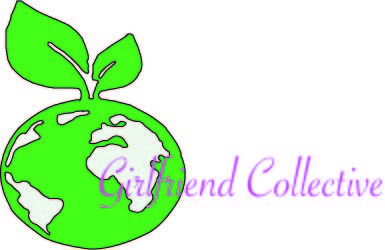
3rd design: For this third design I wanted to tie into the green movement girlfriend collective is about. So, I decided to trace a earth with a plant growing out of it to symbolize the sustainability girlfriend collective stands by. The contrast I used for this one was the bright purple pink lettering to show the customer what they should be looking at.
For project 3’s logo requirement I most likely will use the technique used above + incorporate it as a logo. Mainly because I like the effect it gives the dragon. It would look especially cool on a garment of clothing.
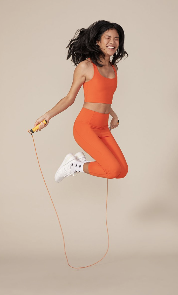
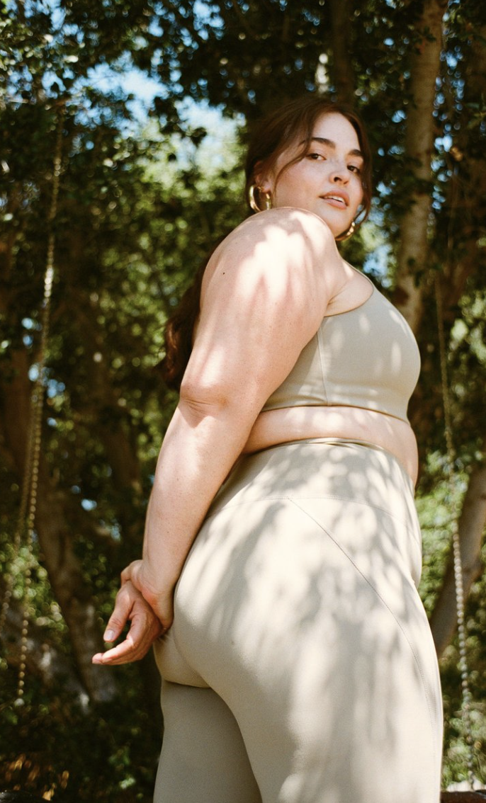
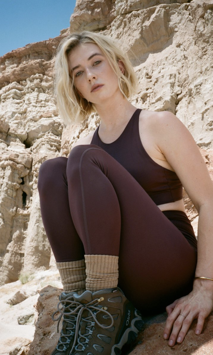
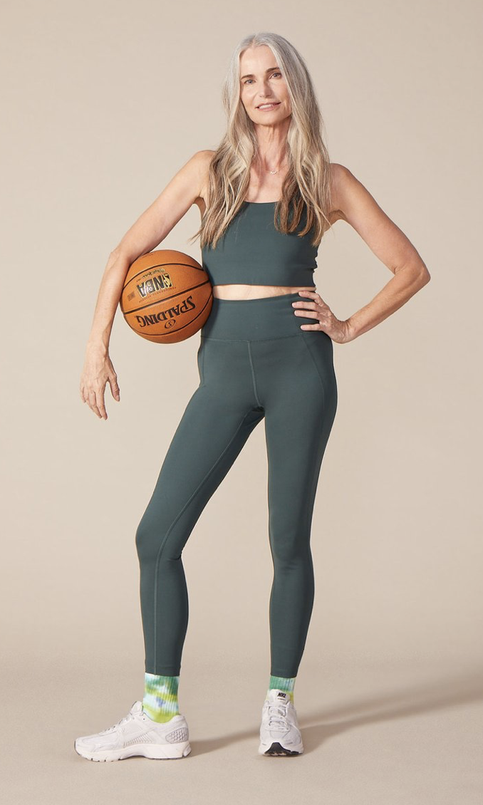
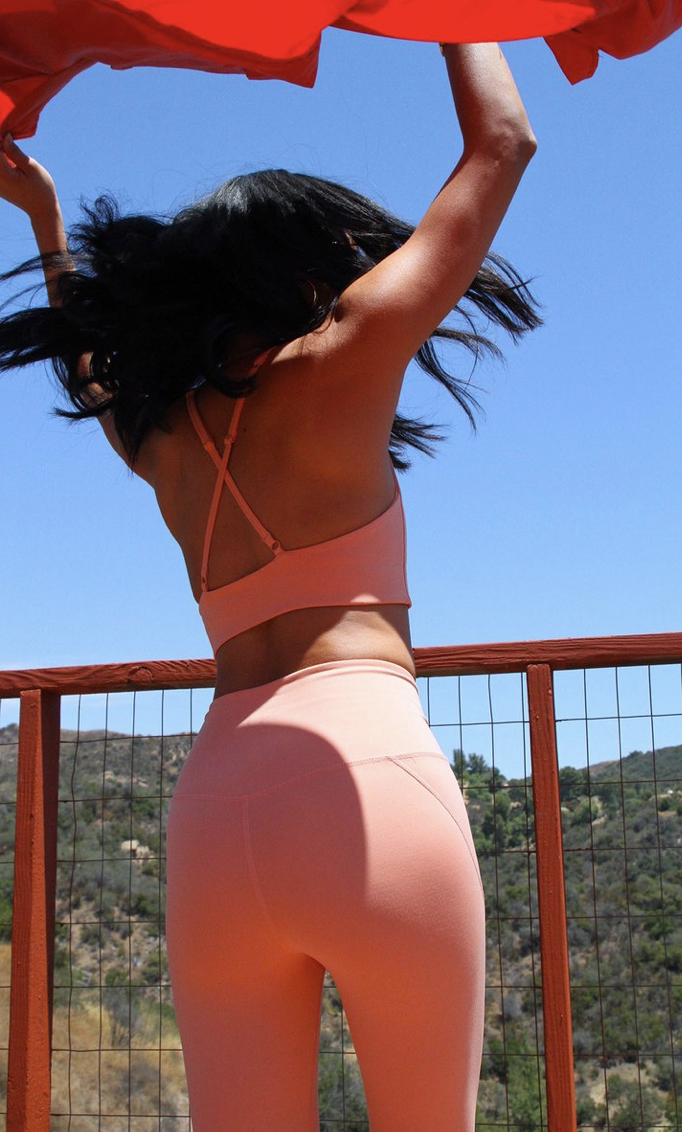
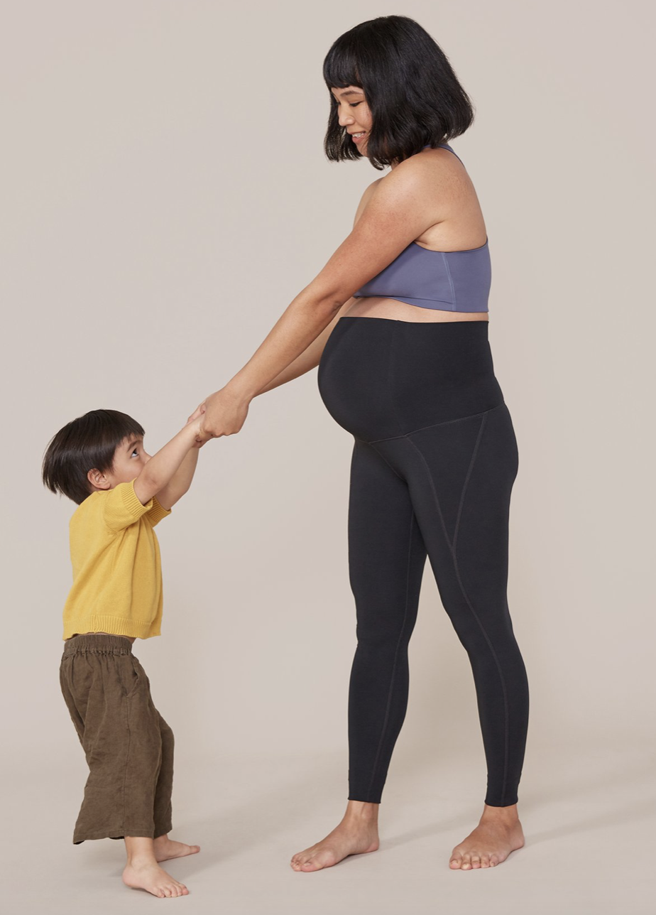
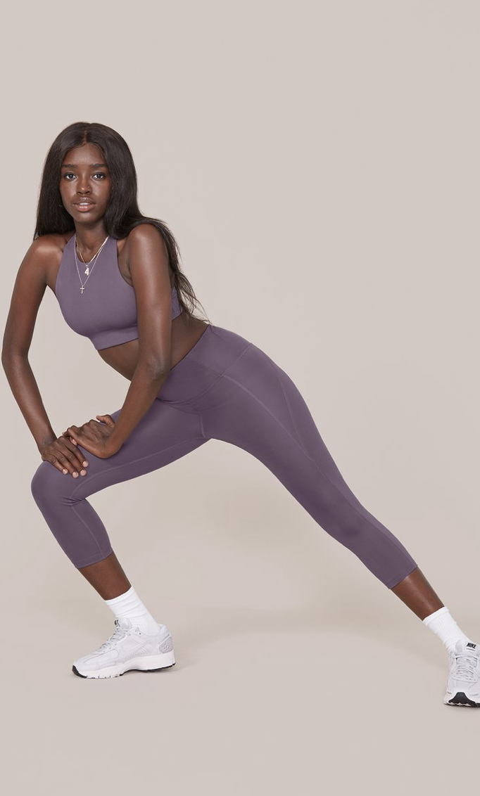
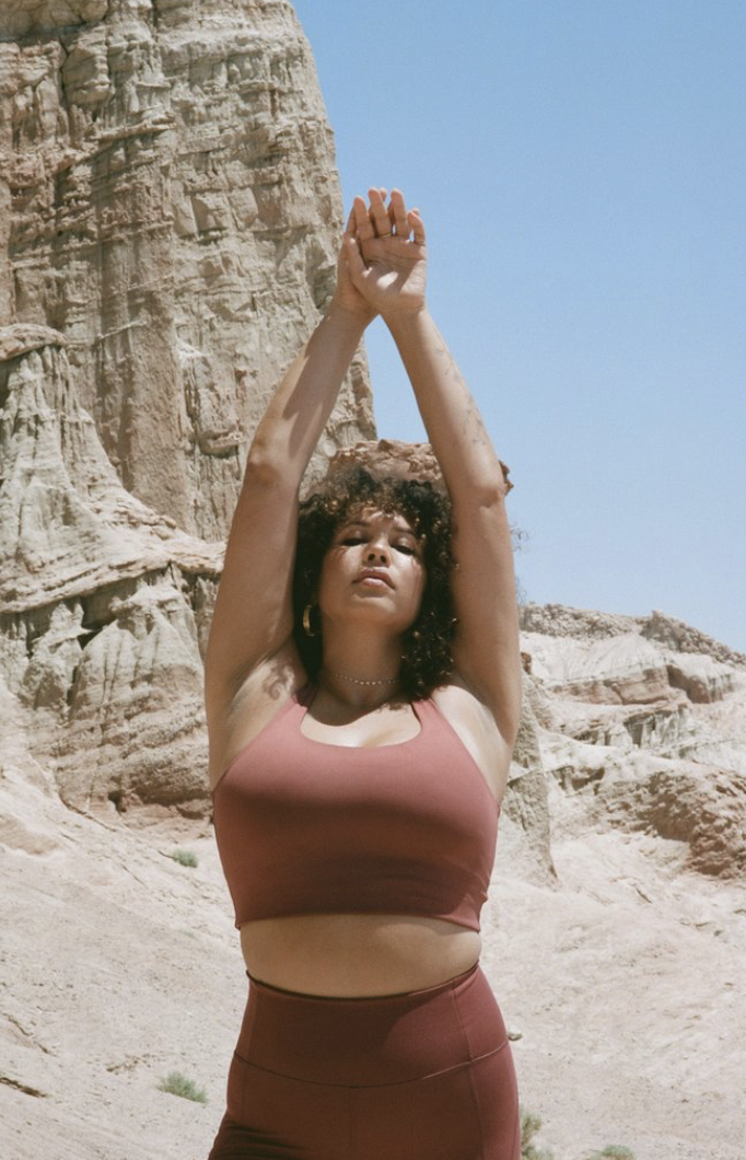
I have chosen girlfriend collective because it’s an environmentally sustainable athletic brand. I also have quite a lot of their activewear and genuinely support their brands message. Their leggings are made from 25% recycled water bottles. Not only is Girlfriend Collective great environmentally wise, their activewear is also quite reasonable pricing wise for the every day woman. From the time they first launched, when they just offered leggings, they’ve expanded quite a lot into other realms of activewear, such as; sports bras, tops, etc. They’re also size inclusive, supporting all body types and ages. I can’t stress enough how amazing this brand is.
Some patterns that will be emerging in womenswear is:
scrapbook designs
scattered bloom florals
minimalist mundane
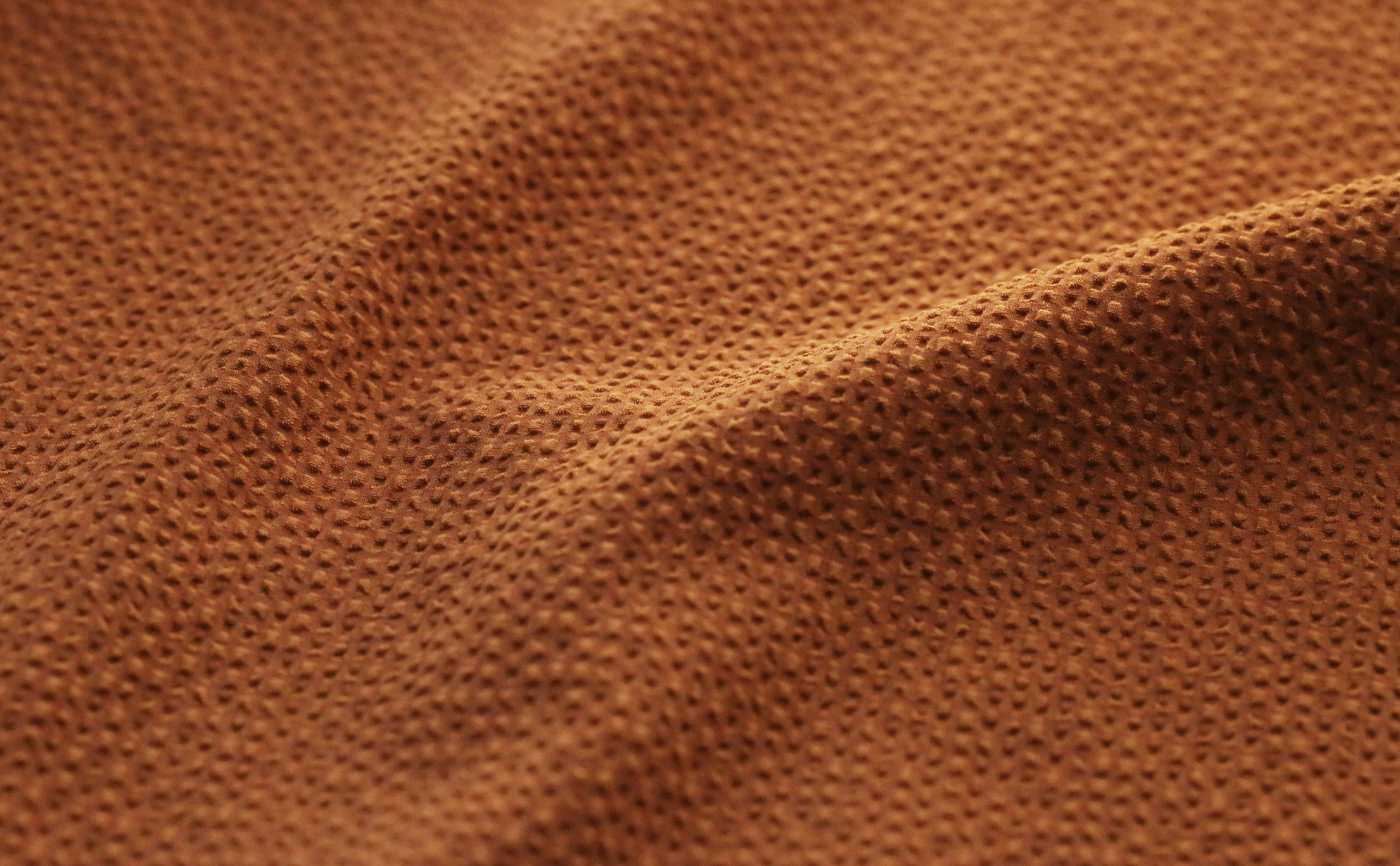
earthy ikat
plant power
spiritual graphics
natural wave
retro ditsy
expressive strokes
internet web graphics
Silky quilting
Voluptuous plush
Paper touch
Rubbed away
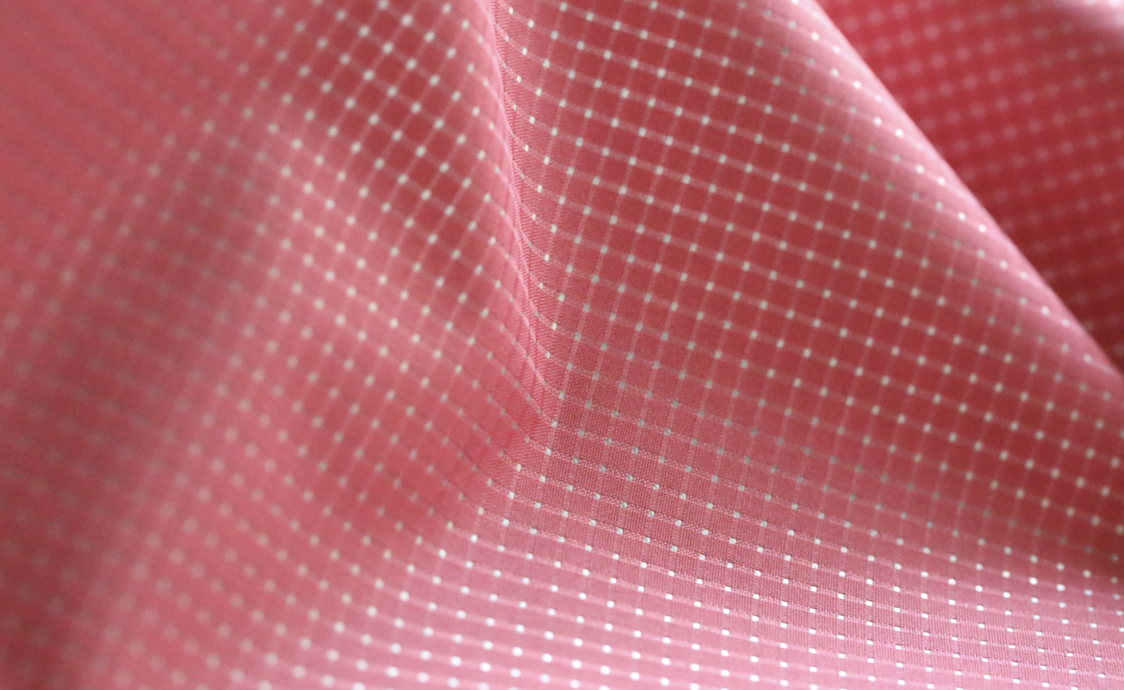
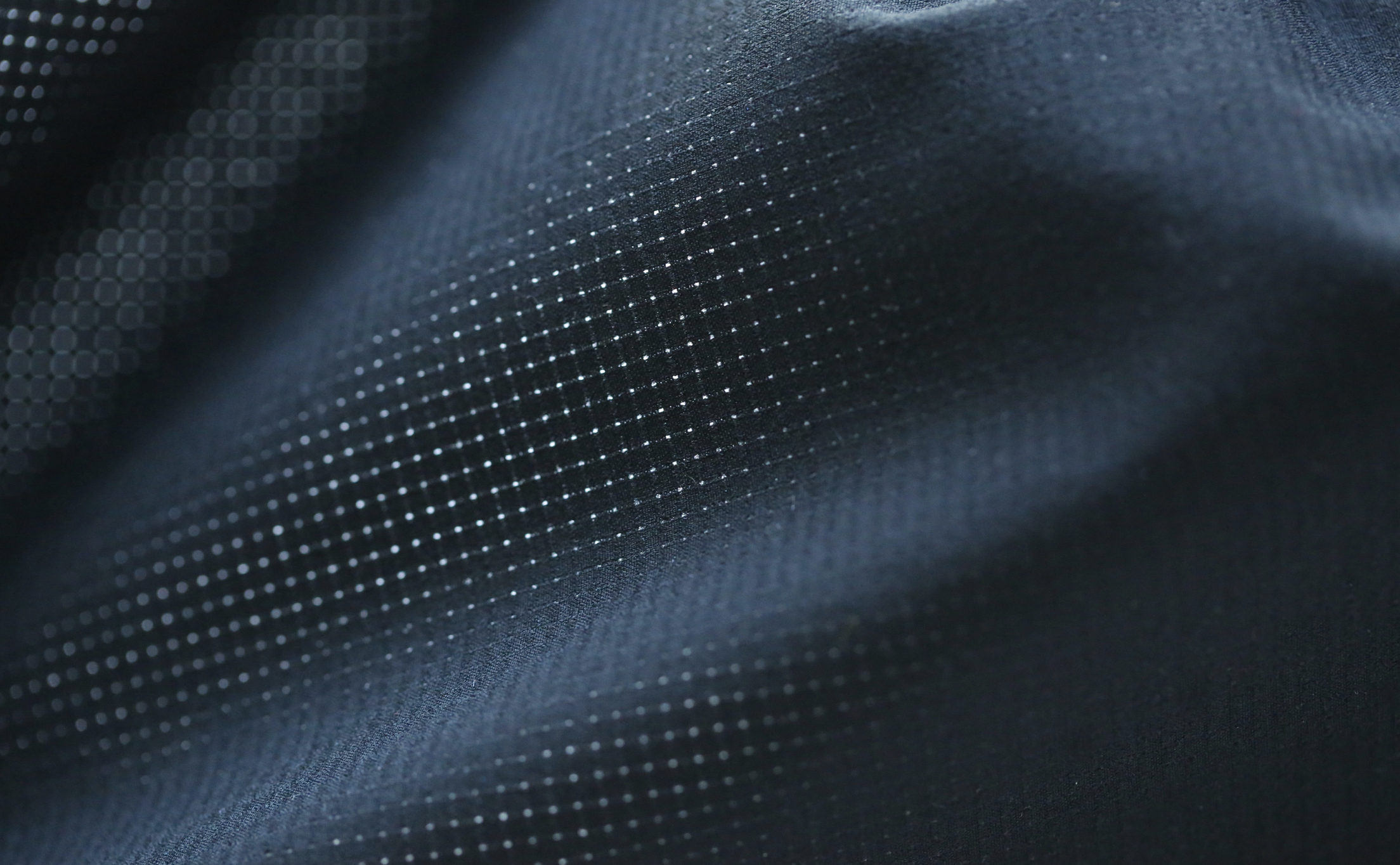
Classic stripes + checks
Outdoor utility
Salvage texture
Modular Blocking
Glitched classics
Reinvented plastics
Brushed warmth
Bio-camouflage
Contaminated Carbons
Mirror reflection
Virtual Dimension
Pearlised Radiance
Geological Metallics
Crystalline Texture
Some colors in womenswear that will be emerging is:
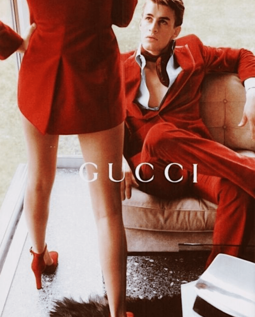
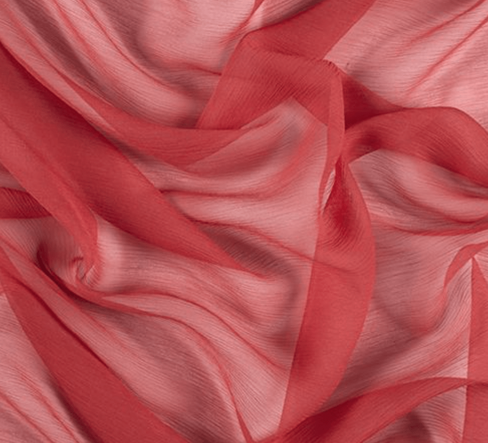
Reds
Blush
Light blues
Dark blues
Rustic orange
Olives
Whites
Greys
Browns
Multicolors
Muted yellows
Champagne colors
Blacks
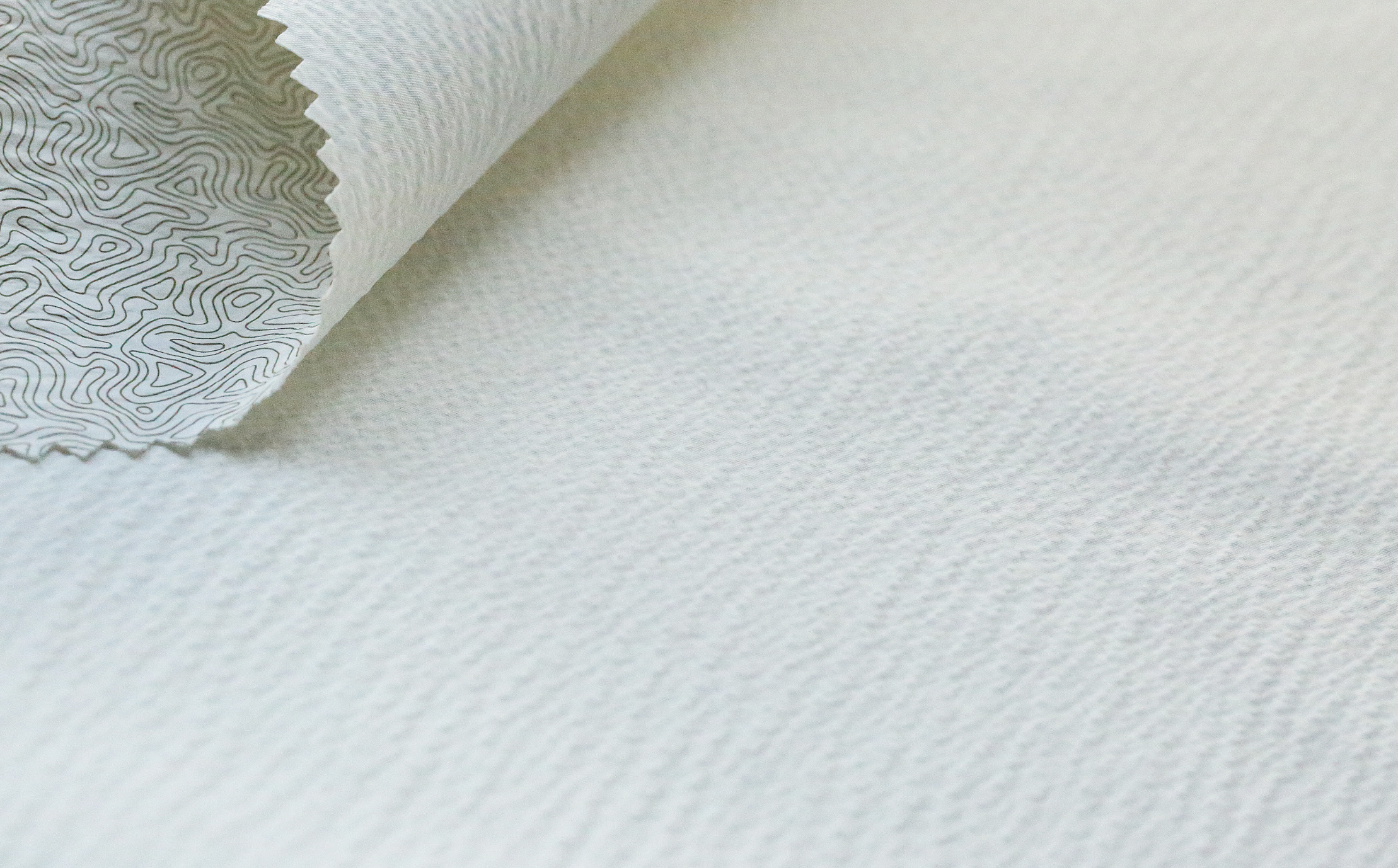
New developments/trends in textiles that will impact activewear trends would be:
Reinvented plastics: (making sustainable activewear out of recyclable materials)
Internet web graphics / futuristic style: starting to make its mark in the activewear industry
Minimalist mundane: is impacting activewear trends for a more classic everyday look
Colour Plains: Flamboyant colors have especially made their mark in athletic wear. Giving an outfit a statement even if it’s just Athleisure
How might you incorporate them in your designs?
I will incorporate a lot of these designs that align with the culture I’m researching by including the surface texture, fresh tones, and delicate grid patterns into the designs I specifically create as inspiration from these trends.
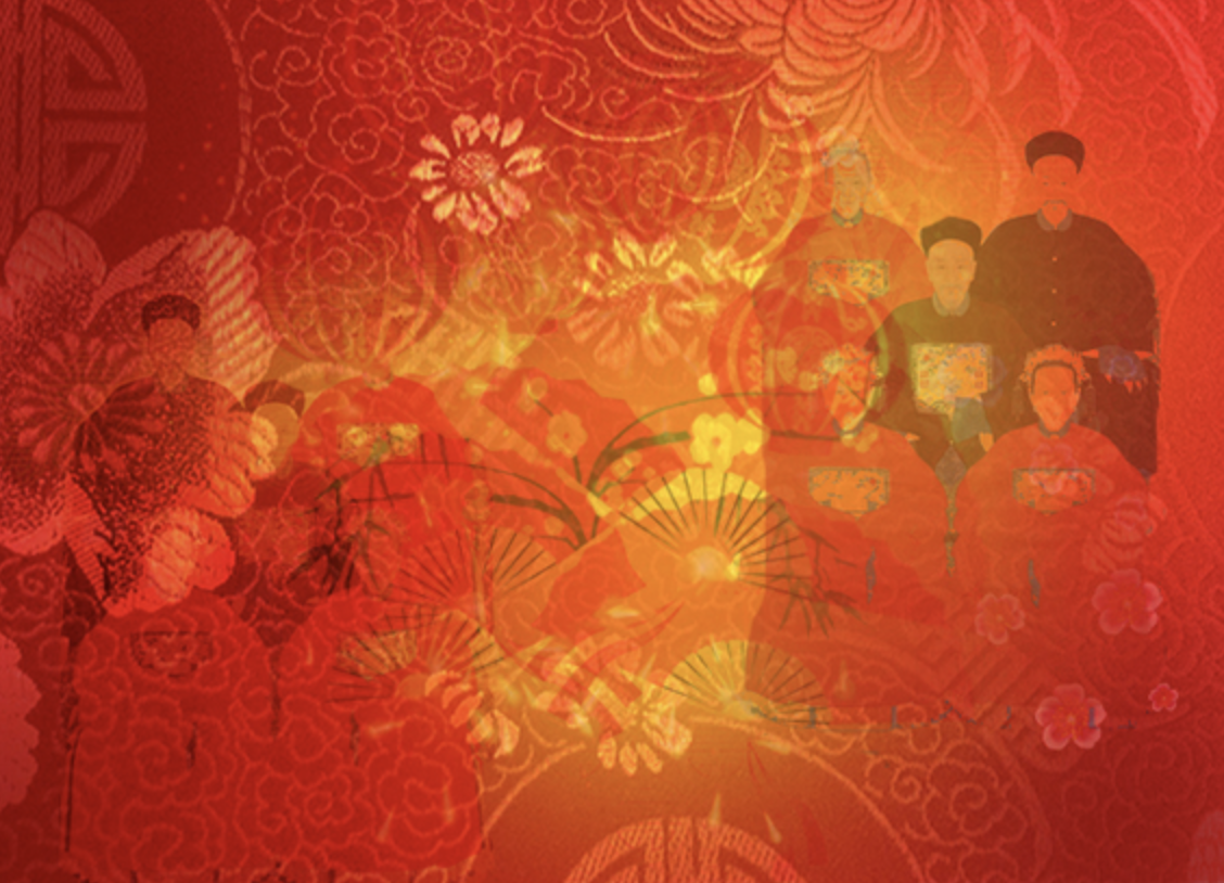
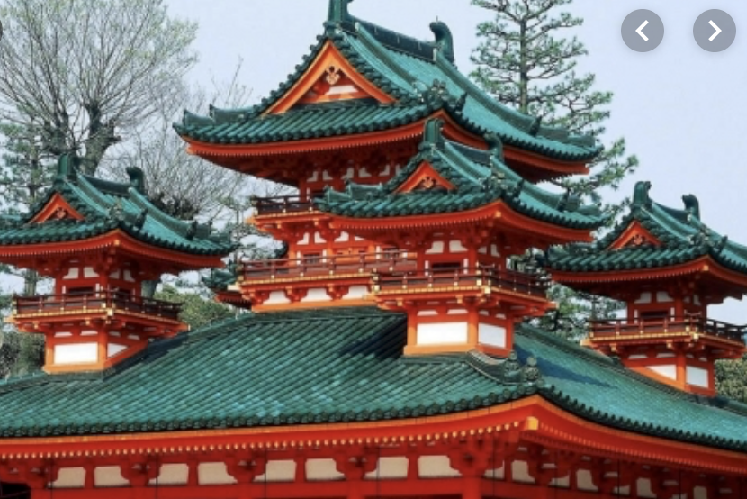
I selected the Chinese culture because I’ve always been very fascinated by their history + culture. It’s actually one of the oldest cultures in the world.
Five Things I Learned:
1.4 billion people live in China
The Country is also divided into 23 provinces
Tea drinking serves not just as a way to better enjoy life, but also a symbol of etiquette in all aspects of people’s lives
The Chinese also believe the animal signs in the Chinese zodiac represents how others perceive you and how you present yourself.
This tradition of the Zodiac was fixed by Taoists in the 10th Century AD
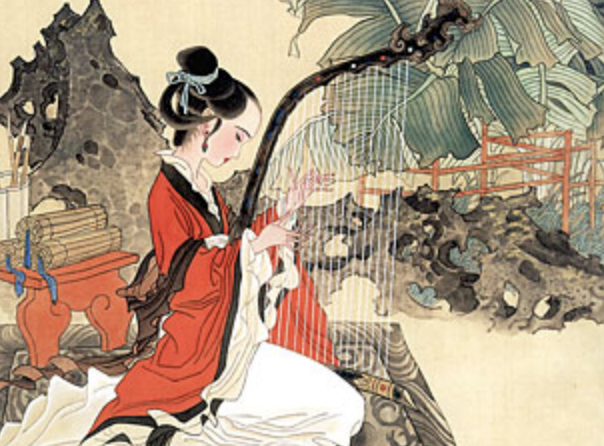
Embroidery technique is very widely used and has actually been popular for thousands of years. Most of these embroideries are actually made of silk.
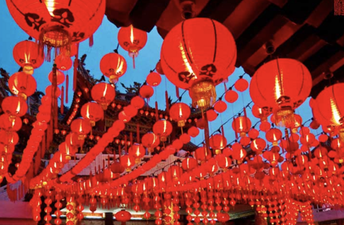
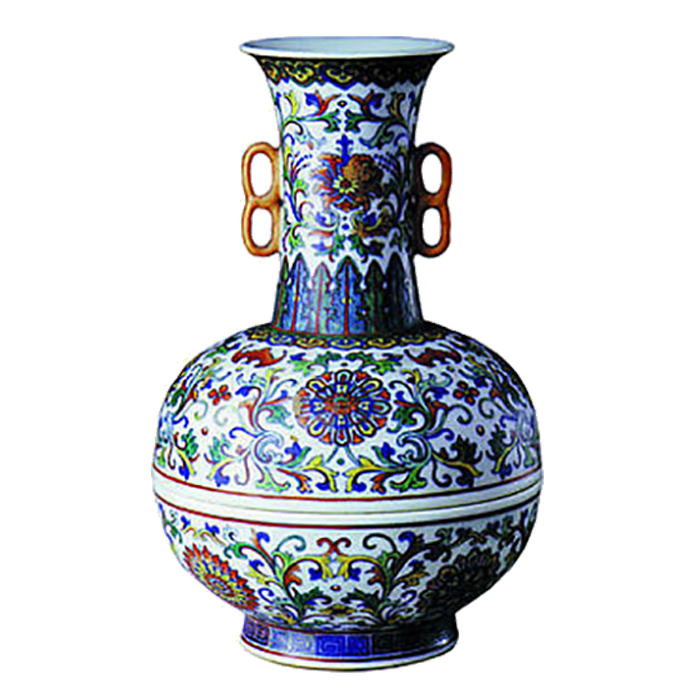
Some common themes in Chinese prints includes; nature, flowering shrubs, bright swirling patterns, dragons, and peony patterns. They really use color by using quite a lot of Reds, Blues, Whites, Greyish Browns, and Golds. The colors are pretty varied when it comes down to it.
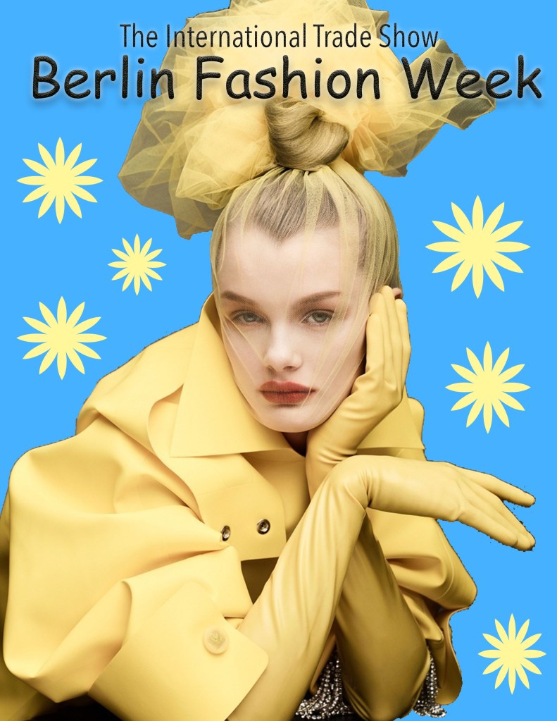
This Ad that I created as an update from the previous one (shown above) is a prime example of center alignment, contrast, proximity, and repetition. Between the bright yellow and the vibrant blue background, contrast is shown. The way the model is shown on the poster on the right shows center alignment. Especially since your eyes are drawn from the top text and shift downwards towards the model in the center. Proximity is also shown with the two rows of the bolded titles that are grouped together. Last but not least, repetition is prevalent in the way the yellow of the garments on the model repeats in the designs on the background.
The extra steps I took to personalize these images in photoshop
The Ducky:
In the ducky picture I added shadows of different ducks in the water from above.
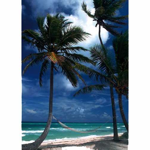
The Palm Tree:
For the palm tree, I saturated the photo to make it appear like a different time of day.
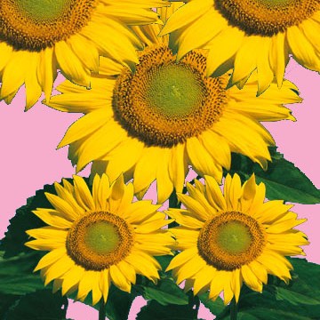
The Sunflower:
I duplicated the large sunflower to make it seem like they’re surrounded by many other sunflower’s
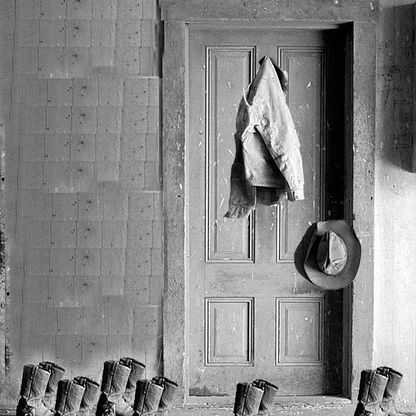
The Ranch House:
The extra step I took with the ranch house was that I duplicated another pair of boots. This time, in the front of the door to make it appear a little more messy.
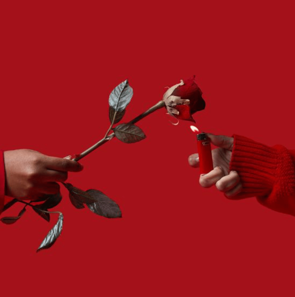
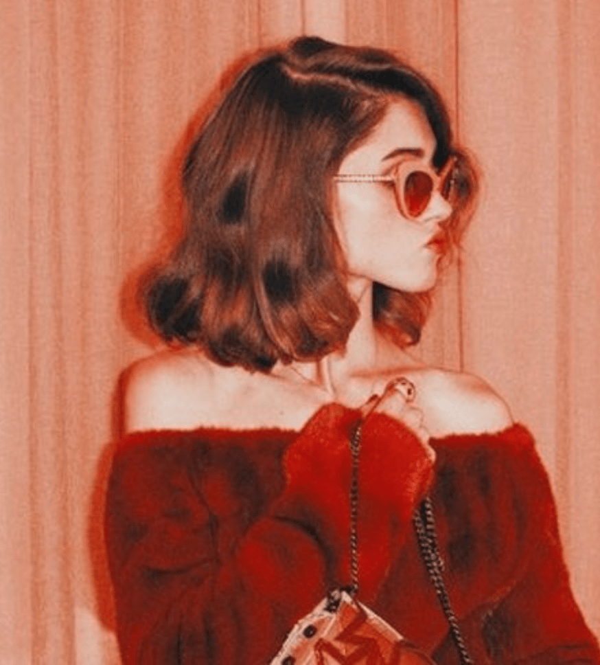
The color relationship I chose in this collage was pink and red because red is genuinely one of my favorite colors. I love the richness of the colors when they’re intertwined together especially. This combination has really always intrigued me. It’s very loud and bold, kinda like me 😉
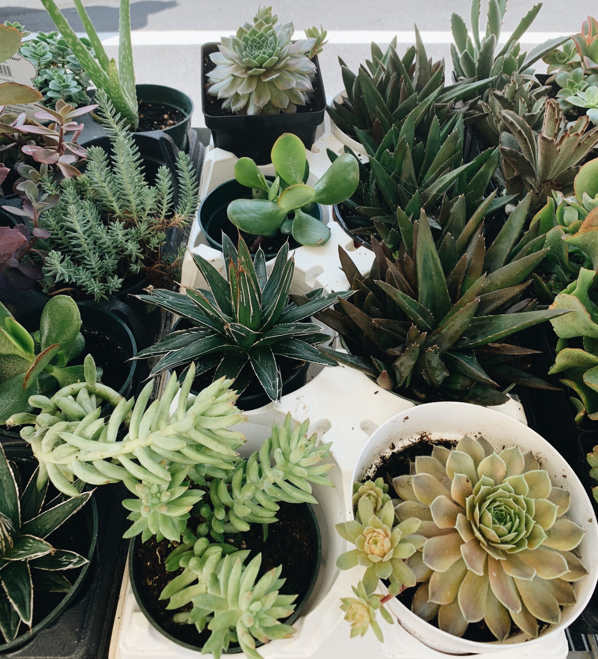
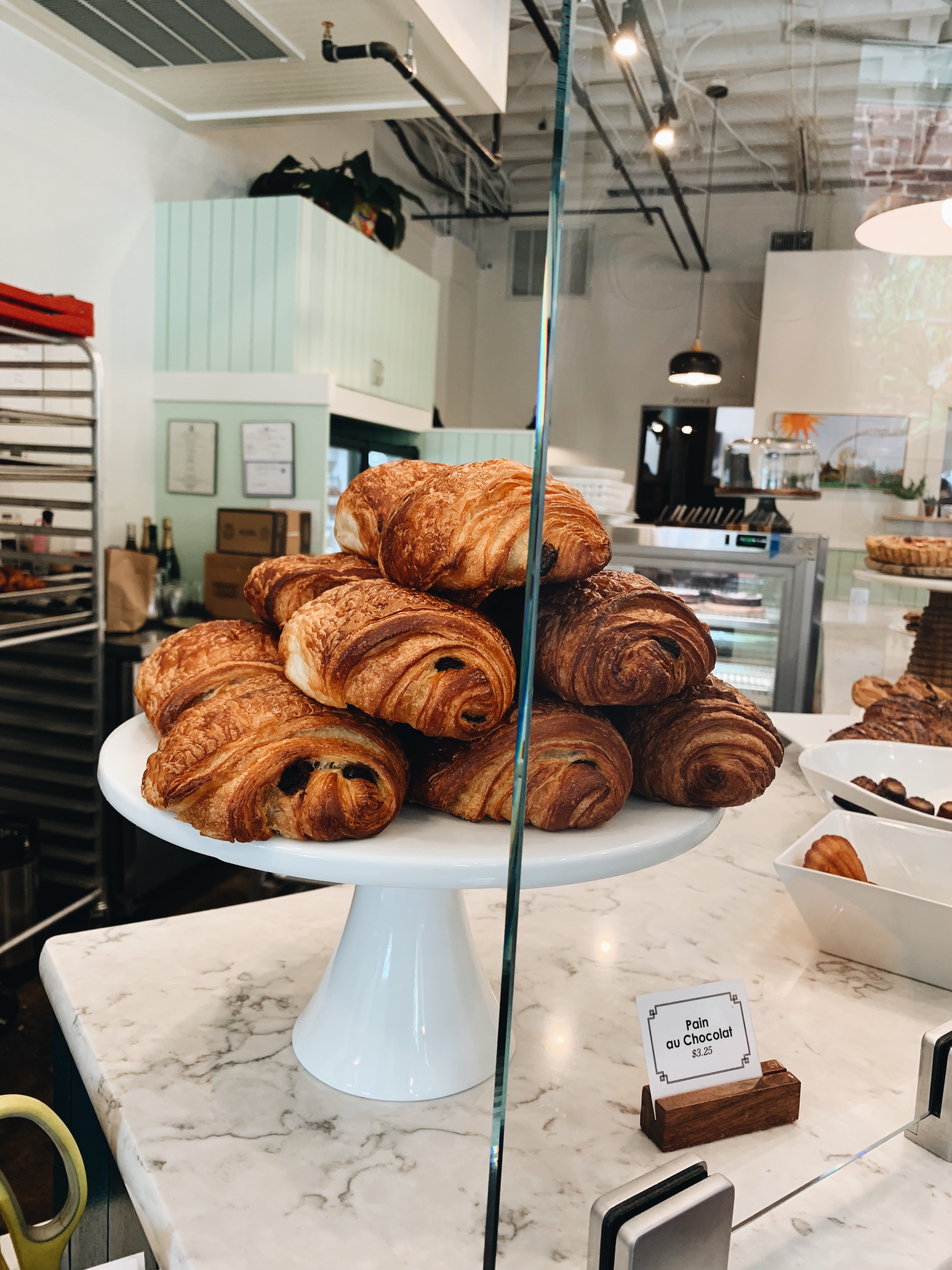
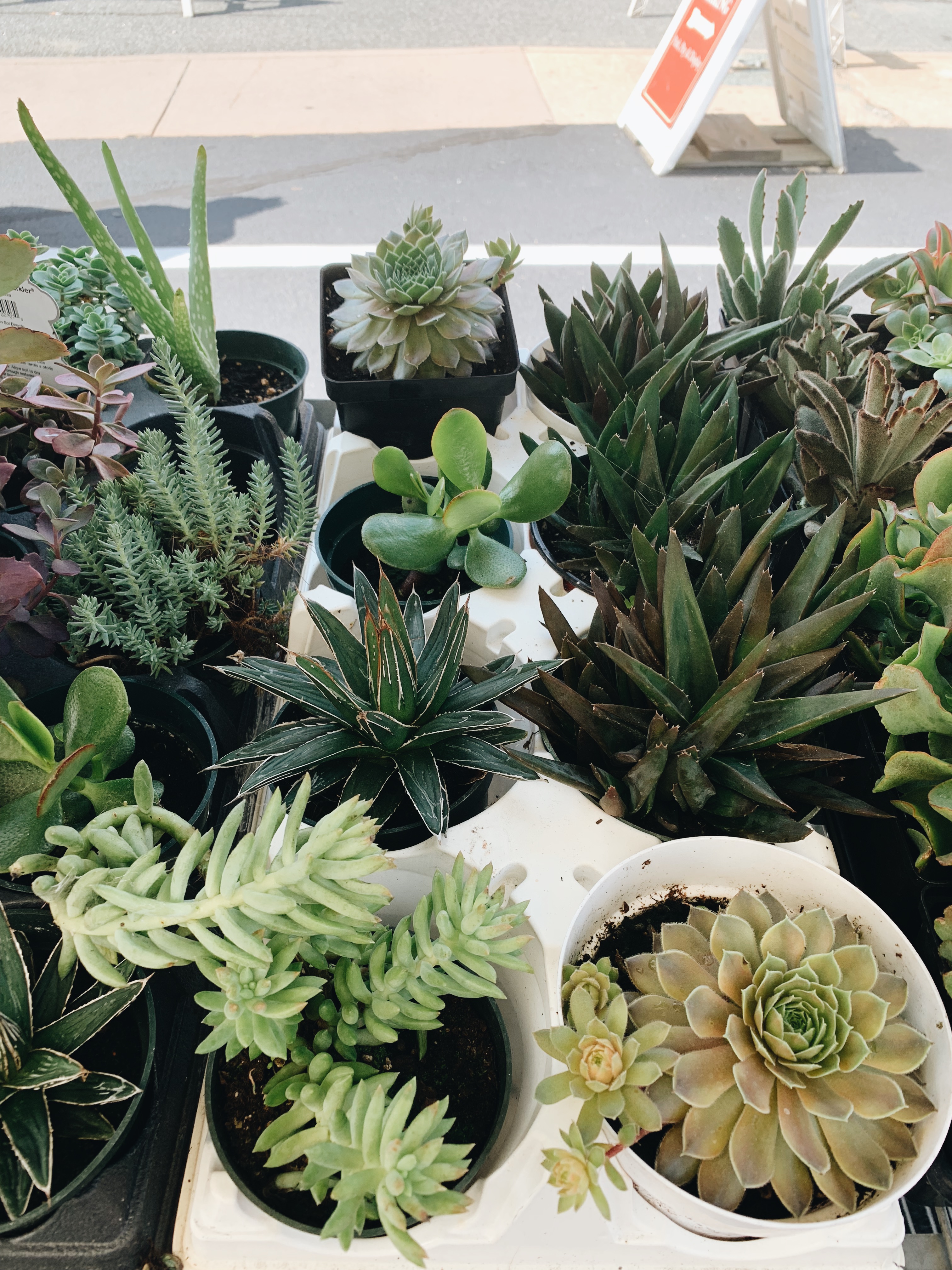
coffeeeee 😉yummy chocolate croissants tiny lil succulents
I always love heading out to the farmer’s market in my hometown and trying all of the different kinds of foods they offer. This weekend has been such a blast. I loved every second I spent with my family and loved ones. Not only are farmers markets a great way to find new venues you wouldn’t normally go to. But, it’s also a great way to shop locally sourced food.
Locally sourced food has soooo many benefits. The flavor is always unmatchable, you support the local economy, benefit the environment, and help promote a safer food supply. I could go on and on and talk your ear off about this subject; but, instead I’ll just settle for this small little post.
For most things, I try to buy local. From the food, to the jewelry and art too. Supporting these different types of locally made products is a great way to cut down on your use of plastic! I’m definitely far from perfect though and will sometimes give in to the fast fashion and pace of our society.
Not only is it more sustainable, I also really enjoy purchasing locally made clothing and accessories from independent artists. Every place I travel to, I try my best to pick up an article of clothing, earrings, jewelry, etc. from different artists in that specific area.
Earlier this year I visited London, Amsterdam, and Paris. In London my two favorite articles of clothing I got was a sweater and a wrap jacket that was handmade from this very talented local designer. While, in Amsterdam a friend and I stumbled upon this beautiful church which had a pop up thrift store inside. I found so many pieces there that I’ve used almost every day since then. One of my favorite places I traveled to in Paris though was the kilo shops. I go crazy for a good deal. Let’s just say I had to pay the overweight fee in order to get my suitcase back to the states (yikes!).
All in all, the pros for buying local really does outweigh the cons. Even if it’s something as small as buying a reusable straw, we all can somehow contribute to the betterment of the world we live on. Your town thanks you, your waterways thanks you, and the earth thanks you.